
Predicted Web Design Trends of 2018…
As we start a new year, we have reflected on the trends of 2017 and what we predict to be continued or new trends for 2018.
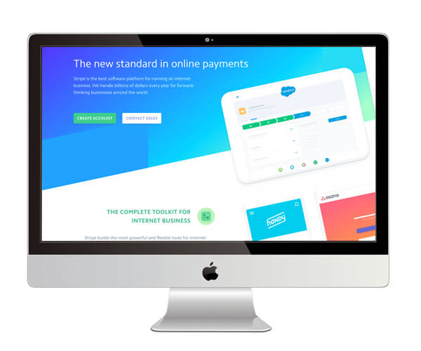
—Flat Design (again!)
Many people think Flat Design may be ‘dead’ but we think it is just merely adapting to stay relevant and therefore will continue to be another trend this year. Flat Design seems to have evolved into more semi-flat design recently with more gradients, shadows and depth. Gradients were once associated to word art and powerpoint presentations, however they have made a comeback and seem to be teamed well with Flat Design using more softer subtler transitions!
Similar to the use of gradients, shadows were once ‘shelved’ due to usability in certain browsers being poor, however they are now being used more and more across website design. We think you will start to see more experimenting with shadows to add depth to flat design but this time with more updated, softened and styled shadows.
Flat Design has been utilised with big brands such as Instagram, Dropbox and Mastercard who have all developed and adapted their design as time moves on across their branding & website development.
—Video
Is this old news?
Video online is already BIG, however, it does still remain a bit of a controversial web design element to some professionals. Some see it as a distraction to the end user if it is not placed in the best way. The usefulness of the video depends on what the website is trying to achieve.
We believe that a big hero video still has it’s place when viewing a website on a desktop. Powerful, enticing and impacting. We think that by having something like this greeting the end user as soon as they land on the site will help to showcase your brand, company values and product focus. It is all down to how you decide to use the video and the content you do use is key!
Whether it be a hero background video at the top fold of your home page or an information demonstration of a product further down the website, we strongly believe they are still powerful tools which you will see more of in the coming months!

—Subtle Scroll Effects
Parallax scrolling was the big trend last year but this has been and gone. Although this is still widely used, it is becoming less a priority with website design due to slower load times and it often can have a negative impact on usability.
We have recently been playing with more subtle scrolling effects which still give depth to a website but do not have a negative effect on page load. Sometimes, just using a background layer sat behind a transparent layer can be all you need – the background image stays static with the website content layers scrolling over the top, giving you glimpses of the background image now and then.
It is all about layering! It is a trend that is often seen in the digital advertising world with the scrolling format already pretty well established. It is a positive experience for the user as they almost are in control to reveal what content is below rather than it popping up and interfering with their user experience.
Some cool subtle scroll examples: Made by Many | Le Mugs

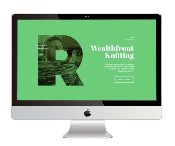
—Typography
Again, another continued trend is the visual use of Typography. In particular, Serif fonts are making more of an appearance now too. This is a trend which we saw really take off throughout 2017 and is becoming more and more popular.
Typography is a powerful weapon, the bigger the better in most cases! We think more and better use of typography is a trend to watch out for this year and in particular more sites using contrasting serif and sans-serif fonts to create dynamic visual design.
Getting creative with typography will really help to enhance your website and yes, you can really use this on your landing page to create that initial eye catching title – or you can get more inventive and use cut out typography. This technique uses a block of colour over a still or moving image that appears through the clear lettering. You need to be bold with this for it to be effective, but when it works it is definitely memorable!
Awesome example of creative cut out typography, make sure to scroll on the home page – Nurture Digital
—Mobile UX Design
In 2017, we saw a huge surge for Mobile Websites since Google announced they were making changes to the way your website is listed if it is not deemed as ‘mobile friendly’ and ‘responsive’. Many people still have not moved forward with their website development and still offer a poor user experience when on mobile.
We believe that as we move into 2018, we will see more development with Mobile Website Development. We expect to see more development and innovations to utilise mobile functionality that we have never seen on the desktop. There will become more intuitive ways to organise information beautifully and more elegant user experiences including focus on gestures and interactions when it comes to the mobile device.
Sometimes you need to consider how your website needs to be developed further for mobile to allow for better usability in comparison to its desktop state. Animations, hover effects and video will not work as well on the mobile if at all, so the content needs to adapt for reduced screen sizes. User experience is key and we are excited to see further development this year for the mobile and tablet!

OTHER Articles…

The importance of a good website design
Do you know that more than 75% of users judge a company’s credibility just by looking at its website design? That’s crazy, right?! With so much competition and the online market constantly changing and evolving it’s hard to keep up. Have you considered that the look...

3 easy ways to drive traffic to your website
Having a website on a search engine is one thing, the next step is actually to start nurturing what you are putting out there through methods of optimisation and marketing.

Google Analytics 4 – here’s everything you need to know!
Google Analytics 3, better known as Universal Analytics, will no longer be available for use and users will be required to default to the new Google Analytics 4 property if they wish to continue using this analytical platform and tracking your website’s performance.
Fancy a Coffee?
We love meeting new people, learning about different businesses & their industries. Maybe we could start a project together?